


 English
 Español
 Deutsch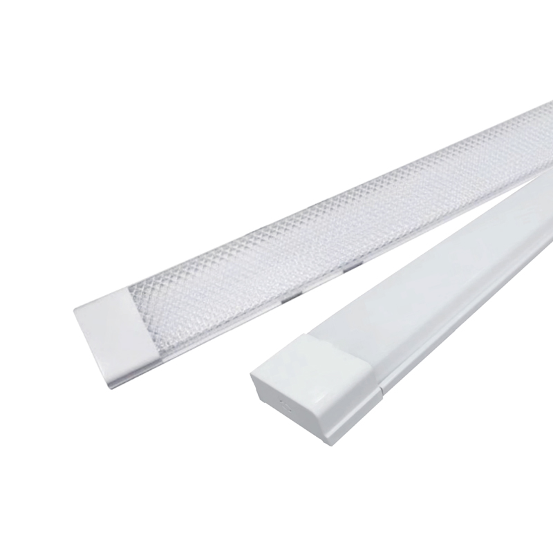

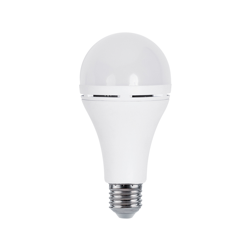
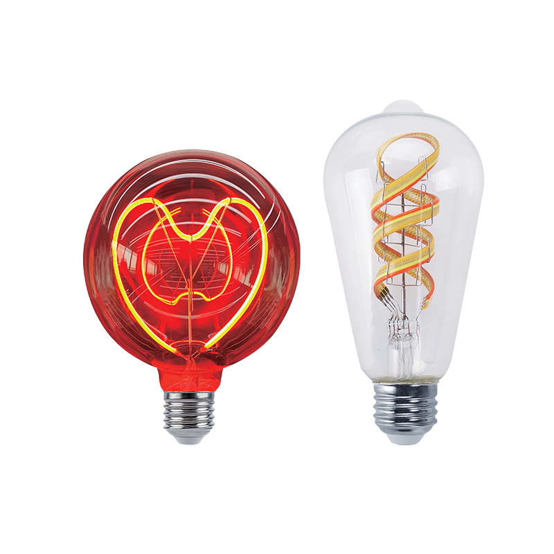
We sincerely look forward to establishing a long-term development partnership with you with good quality and professional services.
Why a Kelvin Number Alone Never Tells the Whole Story
A single kelvin figure printed on a bulb box looks simple, yet it hides a surprising amount of information. A light color temperature chart is the tool that unpacks that number, showing where a given fixture sits between the orange glow of an open flame and the pale blue of an overcast sky. Reading it correctly is less about memorizing figures and more about connecting a number on a scale to how a room will actually feel once the switch is flipped.
Color temperature describes the hue of white light, not its brightness. A 2700K bulb and a 6500K bulb can output the exact same lumens while looking completely different in a room.
This guide walks through the kelvin color temperature chart from the ground up: what the numbers mean, how warm and cool light compare side by side, which kelvin range suits which room, and a repeatable process for making the final call. Specific data ranges and comparison points are used throughout rather than vague generalities, so the chart becomes a working reference rather than a decorative diagram.
Reading the Kelvin Color Temperature Chart From 1800K to 6500K
The kelvin scale used for interior lighting typically runs from around 1800K, the flicker of a candle flame, up to 6500K, which approximates an overcast daylight sky. Every fixture sold for residential or commercial use sits somewhere along this line, and the position determines the emotional and functional character of the space it lights.
Rather than treating the scale as a single continuous gradient, it helps to break it into recognizable bands. Each band below corresponds to a common lighting product category, which is why the same light color scale appears repeatedly on packaging regardless of the fixture type.
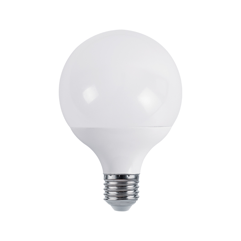
Compact led smd bulbs are useful for this comparison because a single fixture design is often manufactured across the entire 2700K to 6500K band, letting the same form factor demonstrate every point on the chart without changing shape, size, or wattage.
How a Color Temp Chart for Lighting Connects to Human Perception
Kelvin values are not just a visual preference; they correlate with how alert or relaxed people tend to feel under a given light source. Lower color temperatures read as calmer and softer, which is why 2700K remains the default for bedrooms and living rooms. As the scale climbs past 4000K, light starts to resemble midday sun, and most people report feeling more awake and focused under it.
This pattern shows up consistently enough that a color temp chart for lighting is often paired with a secondary axis describing perceived alertness rather than just hue. The relationship is not perfectly linear, but the general upward trend from candle-like warmth to daylight-like brightness is well documented across general lighting research.
This is why lighting designers rarely pick a kelvin value in isolation. A home office lit at 2700K may feel cozy but sluggish by mid-afternoon, while the same room at 4500K to 5000K supports sustained focus without the harsher edge of full daylight-rated fixtures.
Warm White vs Cool White: A Side-by-Side Comparison
Warm white and cool white sit at opposite ends of the same light color scale, and each has clear strengths depending on the task at hand. Warm white, generally 2700K to 3000K, favors relaxation, skin tones, and evening comfort. Cool white, generally 5000K to 6500K, favors detail work, color-critical tasks, and spaces that need to feel crisp and clean.

Kitchens, garages, and workspaces often lean toward the cool end, and a recessed led panels & downlight is a typical way to deliver that even, high-clarity coverage across a counter or work surface without harsh shadowing.
Matching the Light Color Scale to Every Room in the Home
Once the warm-versus-cool trade-off is clear, the next step is applying it room by room. The table below reflects widely used starting points; personal preference and the amount of natural daylight a room receives can shift these ranges by a few hundred kelvin in either direction.
| Room | Recommended Range | Primary Reason |
|---|---|---|
| Bedroom | 2700K - 3000K | Supports winding down before sleep |
| Living Room | 2700K - 3000K | Comfortable for extended relaxation |
| Kitchen | 3500K - 4000K | Balances clarity with a welcoming feel |
| Bathroom | 3500K - 4000K | Accurate color for grooming tasks |
| Home Office | 4000K - 5000K | Supports sustained focus |
| Garage or Workshop | 5000K - 6500K | Maximizes detail and safety visibility |

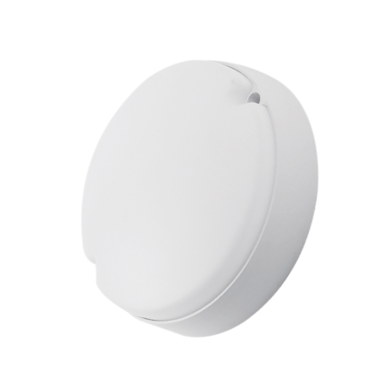
Whole-room ambient fixtures such as an led ceiling lights unit are frequently sold in switchable versions covering 3000K, 4000K, and 5000K in one product, which lets a single fixture serve multiple rows on this table without needing separate purchases for each room.
A Practical Process for Choosing the Right Kelvin
Rather than guessing from a paint-chip-style chart in a store aisle, a short evaluation process produces more reliable results. The steps below move from the room's purpose down to a final, testable decision.
Step four deserves particular attention: two bulbs can share an identical kelvin rating yet render colors very differently depending on their color rendering index, so the kelvin figure and the rendering index should always be checked together rather than in isolation.
Common Mistakes When Reading a Light Color Temperature Chart
Even with a chart in hand, a few recurring mix-ups lead to disappointing results after installation. Reviewing them before buying saves a return trip to the store.
- Assuming a higher kelvin number always means a brighter room, when brightness is actually measured separately in lumens.
- Mixing kelvin ranges within one open space, which makes adjoining rooms look mismatched under a single sightline.
- Ignoring the color rendering index and judging a fixture on kelvin alone, which can leave skin tones and food looking dull.
- Choosing a kelvin value from a small in-store sample rather than testing it under the room's actual wall colors and furnishings.
- Overlooking dimmable warm-dim options, which shift color temperature downward as brightness is lowered for evening use.
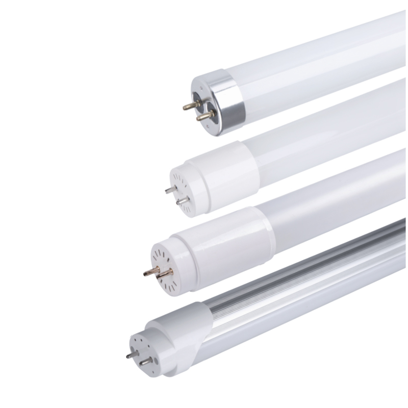
A linear LED tube light above a workbench illustrates this well: the same fixture at 3000K reads as ambient and cozy, while at 5000K it becomes a genuinely useful task light, all without any change in wattage or lumen output.
Frequently Asked Questions
Q1: What does the kelvin number on a light bulb actually measure?
It measures the color appearance of the white light, ranging from warm amber tones at low numbers to cool blue-white tones at high numbers, not the brightness of the bulb.
Q2: What is the difference between a light color temperature chart and a lumen chart?
A color temperature chart shows hue, from warm to cool white, while a lumen chart shows total light output. The two are independent and should be checked together.
Q3: Which kelvin range works best for most living rooms?
Most living rooms are comfortable in the 2700K to 3000K range, which supports relaxed evening use while still providing enough clarity for daily tasks.
Q4: Can one fixture cover more than one point on the kelvin color temperature chart?
Yes, many current fixtures include a selectable or switchable setting that lets a single unit move between two or three common kelvin ranges.
Q5: Does a higher kelvin value always mean better lighting for work?
Not necessarily. Higher kelvin light supports alertness and detail work, but comfort also depends on brightness level and the color rendering index of the fixture.
Q6: How can I test a kelvin choice before committing to a whole room?
Install a single sample bulb or fixture in the actual room, view it after dark and during the day, and compare it against the room's existing wall and floor tones.
 GET IN TOUCH


